There’s a lot of discourse out there nowadays about the fact that trends are changing faster than ever, and while the phenomenon is mostly addressed when it comes to the fashion world, the truth is that every industry sector that revolves around design has noticed the change. Interior design is no different, and if you’ve been looking for inspiration for a new remodelling project, you may have noticed that micro-trends have become popular here as well. Rapid consumption and disposal are not good for either your wallet or the environment, though, regardless of what you’re buying, which is why many have started moving towards becoming more conscious consumers and making more sensible purchases.
Moving away from social media can help as well, since it is here that most people see all these trends and begin wanting to replicate them in their homes, too. In fact, the concept of fast furniture has become increasingly well-known recently, designating the exact same products as in the case of fashion: cheap and mass-produced items where the low costs and trendy designs are the priority instead of the durability. The rise of hyper-specific aesthetics that most people get bored with in a matter of months has exacerbated the issue and led people to buy goods that end up feeling mismatched and out of place when compared to the rest of their rooms, resulting in them being discarded soon after being purchased.
If your kitchen needs a makeover and you still want to have a look at the trends though, there’s a silver lining: the colours that are expected to be popular for the next few months are understated and simple, so they’ll always look good without feeling unimaginative and dull.
A break from minimalism
While the colour palette that is expected to be popular can feel close to minimalism, it is actually a significant difference for those who used to be fans of this look. This trend has been so popular over the last few years to the extent that many have pointed out the irony of commercialising items that are supposed to appeal to those who want uncluttered homes. Turning a philosophical lifestyle into commodities that are meant to be discarded fairly quickly definitely feels antithetical and illogical, meaning that creating a curated life this way is pretty much impossible (especially since minimalism has also become synonymous with a sense of uniformity, which was never the case with the original art movement).
Having several muted items with a simple design and continuing to purchase more is in direct contradiction with the anti-consumption ideas behind minimalism as well, on top of the fact that many people have simply become bored with the look and see it as too sterile for a home. Adding colour, character, and quirks is the way to go, and even if it won’t be the trend forever, it is definitely the style that will make you the happiest.
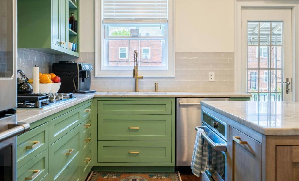
Green
If you’re pivoting towards a style that is highly tailored to your interests, you might be wondering which colour would serve as a great blank slate. The answer is obviously green. When it comes to kitchen colours few options fit as well. Whether you’re going for a retro or an understated style, green will look great and there are plenty of kitchen cupboard doors designs to pick from that can match the overall aesthetic. It is also the most relaxing shade for the human eye, sitting at the middle of the visible light spectrum, meaning that the retina doesn’t need to adjust in order to focus.
The jewel-toned and sage-like greens from the previous years remain popular in 2026, but muddy, olive greens are starting to be popular as well. They bring a pop of colour to the mix, but one that feels calm and versatile. The resurgence green is getting at the moment is part of the larger trend that prioritises earth tones in interior design. They feel grounding and relaxing too, especially when paired with brass hardware, wood tones, cream and ecru, and natural stone worktops. Green feels both organic and refined at the same time, something that isn’t easy to achieve with another colour.
Terracotta
Another timeless classic that will never look out of style is terracotta. This red-brown hue is perfectly rustic and has the feeling of a kitchen you’d prepare a quick snack in on a holiday somewhere in the Mediterranean. Bringing that atmosphere home is something that many want to replicate. Brass and wood accents work great here as well, but if you want more colour, you can match it with deep blue, greige, soft blushes, burnt yellow, and, of course, sage green. Similar to the green, this is also an option that feels grounded and natural.
Blue
Looking to bring more calm and relaxation into your kitchen? Go for blue. Psychology says that this primary colour is strongly linked to peace, tranquillity, and mental clarity. That’s largely because your brain associates blue with the sea and the open sky, wide, expansive places that are also deemed safe. All shades of blue look great, so if it’s your favourite, don’t hesitate to integrate it into your kitchen. Something that you genuinely like will never seem outdated to you. The hues that are predicted to be particularly popular this year are dramatic ones like dark cornflower and charcoal blue.
If you’re worried that they’ll be too dark for your kitchen, though, and make the place look claustrophobic, you can go a few tones lighter. These blues are highly sophisticated, combining depth with elegance and adding a slight metallic glint as well. Light worktops and metal-like, lustrous, and polished hardware are the accents you can count on.
Colour is back in style and will most likely remain that way for the foreseeable future. If you’re looking to move away from the standard white, beige, and greige that have dominated interior design for the last few years, these colours are the solution since they’re versatile enough to be classics but bright enough to bring something different to the mix and allow you to create a kitchen that feels like a space you live in instead of an impersonal lobby.